This My Colections Interior Design

Saturday, September 25, 2010

Great School Designs

I totally agree with the premise of this article from WebUrbanist: “there’s no reason for school buildings to be bland, boring boxes.”

The article compiled a list of the fifteen best school designs in the entire world, and these two are definitely my favourites:

The Ørestad High School in Copenhagen looks NOTHING like my old high school. The interior is like a huge playground – it has swirly staircases, platforms, huge orange pillows, and glass shades that rotate with the sun.

orestad-high-school-2.jpg

orestad-igh-school-3.jpg

From: http://conceptrends.com/2008/04/03/the-school-of-the-future/

The School of Art, Design and Media at Nanyang Technological University in Singapore has the most amazing green roof I’ve ever seen – it’s HUGE, covering a span of five stories. Apparently the roof also works for insulation and conserving rainwater.

singapore-green-roof-1.jpg

singapore-green-roof-2.jpg

From: http://www.inhabitat.com/2008/01/23/amazing-green-roof-art-school-in-singapore/

What are the best buildings at York? Well…

1) Glendon Manor would probably be the first building I’d put on the list. It was originally a mansion built by financier E.R. Woods, and was donated to York in 1960. It sits right in the middle of 85 acres of parkland and has its own rose garden. It was featured in Canadian Homes & Gardens when it was built in 1926, and the whole style is a lovely mishmash of Italian Renaissance and British baronial, according to the manor’s website.

800px-glendon_manor.jpg

dsc03231.JPG

2) Vari Hall won the North York Design of Excellence when it was built in 1992, and it’s easy to see why. It broke up the Ross Building’s massive, concrete dominance over the campus landscape, and softened the look of the commons as well. It’s a student hub, connecting a lot of the major arteries of the university and serving as a student hang out, meeting point and occasional protest site.

vari_front_wide.jpg

vari_rotunda_wide.jpg

3) I’m actually not a huge fan of the newer buildings on campus like Accolade or the TEL building – they just feel too huge for my taste. I much prefer the Vanier-Winters-McLaughlin complex – all three colleges are connected by corridors and tunnels, and have this strange zig-zaggy trajectory you have to follow to travel between them. I’ve gotten lost somewhere between the three buildings more times than I can remember, but it has a smaller, more old-fashioned appeal that makes it feel like a friendly place to be (all of the buildings pretty much look the same way they did in the 60’s). I can’t find any photos of the interior of the buildings, so you’ll have to go there yourself to see what I mean.

Thursday, September 23, 2010

Retro Clock – Flip Down

For those of you who want a trendy and slick looking metallic flip down clock here is the Retro Flip Down clock, a nice piece of gadget to sit on your work desk for telling you the time. Every 60 seconds and hour, the time will flip down automatically without any need for winding or adjusting. The ony thing I’n concerned is if he makes any annoying mechanical noise when it’s flipping the time. In conclusion the Flip Down is a unique looking clock, with a sleek, modern and stylish look. You can purchase it from here. – Via – Techchee

Retro Clock Flip Down

Clock Flip Down

Youthful Orange Bathroom, Milan 2010

We don’t know how many of you out there would go for a colorful bathroom design, but we consider this one to b quite appealing. Cheerful and with a juvenile feel, this orange interior is full of interesting elements and original furniture imprints. The sink is conveniently embedded in a huge sliding drawer, saving space and adding a touch of creativity to the overall design. Random words are imprinted on the mirror surface, which is an interesting approach in case the users want to read something while brushing their teeth every morning. We also like the flashy but cool orange bathtub, which complements the already mentioned bathroom furniture.

orange bathroom milano

orange bathroom34 Youthful Orange Bathroom, Milan 2010


Youthful Orange Bathroom

cool bathroom design

orange bathroom2 Youthful Orange Bathroom, Milan 2010

The Flip Table

The Flip Table is one of the products that I really love. I love this table because it is a great space saver, it can be a coffee table and a dinning table. Starting as a low coffee table on a solid base, the dining table legs flip out to reveal six stools for seating. With the legs flipped up, the table is at dining height. The table earns bonus points for its smart storage of the available cork dining stools, six can be stored underneath the coffee table (above, top left) and popped out for seating at the dining table. You can see how “The Flip Table” become a dinner table from a coffee table on the producer website. – Via – Treehugger


flip furniture

North Carlton Green House by Zen Architects

North Carlton Green House is a breutiful green project designed by Zen Architects, and is located in Melbourne, Australia. The North Carlton Green House was inspired by the clients intuitive connection with landscape and the sun, complemented by our innovative use of sustainable design principles. Plants were integrated into the building to create a living, breathing, sustainable space that is a delight to inhabit. A rooftop garden provides an urban oasis perched above the surrounding rooftops nestled in the tree tops.

Green House Zen

Water consumption is minimized through collecting rainwater and re-using grey water in the garden. The gardens are watered by automated subsurface irrigation systems to minimize water lost through evaporation. Passive heating is provided by a two storey north facing void that allows sun to penetrate deep into the house heating thermal mass of exposed concrete floor and ceiling. Passive cooling is provided by windows located to catch breezes cooled by the courtyard plants and pond while a two storey void facilitates natural heat removal through stack effect


Green House Sea

Green House Home

Green House Wood

Green Home House

Tuesday, September 21, 2010

modern home interior design

http://2.bp.blogspot.com/_ZkaaTuwwZ1Y/SKcQI7fZfII/AAAAAAAAb1I/Il3B4tIMGPk/s400/Living_room_Interior_Design_Home_interior_Modern_Living_Room.JPG

http://t0.gstatic.com/images?q=tbn:CyXUkoP9QoIfyM:http://www.artstudiowork.com/wp-content/uploads/2009/07/c21db5b5811bb34f.jpg.jpg&t=1

http://greatinteriordesign.com/wp-content/uploads/2009/04/houston-texas-modern-interior-design.jpg

http://2.bp.blogspot.com/_ZkaaTuwwZ1Y/SKcQI7fZfII/AAAAAAAAb1I/Il3B4tIMGPk/s400/Living_room_Interior_Design_Home_interior_Modern_Living_Room.JPG
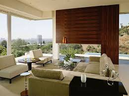
The expansive home has some natural aspects like stone walls, wood and stone floors, and unique metal work to give it a very natural appeal. Normally these types of materials are cold and hard but the architect used rich colors and created a very warm effect.

modern home design

http://besttopdesign.com/wp-content/uploads/2009/06/modern-home-design-sosnowski-residence-5.jpg

http://besttopdesign.com/wp-content/uploads/2009/06/modern-home-design-sosnowski-residence-4.jpg

http://farm3.static.flickr.com/2194/2386745491_60745c7862.jpg

http://besthomegallery.com/wp-content/uploads/2010/03/modern-home-design-interior-d.jpg
This is modern house called Sosnowski designed by Chen + Suchart Studio in Tempe, Arizona. Located on the outskirts of Tempe’s urban center, the home exudes an industrial aesthetic. A pronounced steel frame constructed from I-beams is the skeleton for the upper volume, which sits upon a concrete block base. The façade of the upper level is composed of thoughtfully placed windows and naturally weathered corrugated steel panels. The interior pairs concrete floors, exposed ductwork, and industrial light fixtures to create a loft-like atmosphere. Despite its industrial pretense, the Sosnowski Residence remains habitable and inviting thanks to a central gathering space on the ground level that merges the living, dining, and kitchen areas into a single space that fully opens to the surrounding city and desert.

bedroom Design Ideas

http://blog.purentonline.com/wp-content/uploads/2009/10/bedroom-design-ideas-huelsta-multi-forma.jpg

http://freshome.com/wp-content/uploads/2008/12/bedroom-ideas-hulsta-1.jpg

http://www.interiordesigner.in/wp-content/uploads/2009/05/teen-bedroom-decorating-ideas-2.jpg

http://www.digsdigs.com/photos/bedroom-design-huelsta-elumo1-554x367.jpg
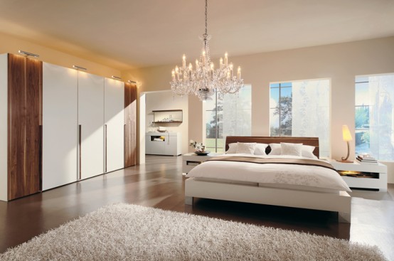
The bedroom is one of those places that takes time to decorate. You can always improve it because you always get bedroom ideas. This time it’s Hulsta to get our inspiration from. The spacious rooms all put a great accent on oak and alder furnishings plus some white and brown lacquered glass, and look amazingly perfect. Clean shapes, amazing eye-friendly colors and designed for those who need their room to be either beautiful and able to store all their stuff. Would you put something like this in your bedroom? Which one do you like the most?

kitchen design ideas

http://freshome.com/wp-content/uploads/2007/10/modern-kitchen3.jpg

http://www.precisionpaintingplus.net/blog/wp-content/uploads/2009/08/kitchen_design_hardwood_mouldings.jpg

https://blogger.googleusercontent.com/img/b/R29vZ2xl/AVvXsEj0kKvyMRLSw39cQZpVX7lwGrYfN0gMKAF8q6ZHLr7mPMr6Hf1k65Rrvs0oR6Xn4B8JKus-R1YsG28m8b9iFkpF3TD72rAz-PMFdMuB42miu8wVld13X6One6hwX1J4BR-PI9Kdya3l0eY/s400/IMG_2647_medium%5B1%5D.jpg
The kitchen is one of the main focal points of your home and the kitchen cabinets you have are the first thing your guests see. One of the quickest and cheapest ways to update your kitchen is to explore some kitchen cabinet refacing ideas. By renovating kitchen cabinet doors you will be able to give your kitchen a whole new look at a fraction of the cost.

AD

Related Posts Plugin for WordPress, Blogger...